Project
Meta ✦ Workplace
Role
Visual designer
Delivery
Responsive website
Design system
Year
2020 - 2022
Link
Workplace.com →
Team
Helin Kotan – Creative Director
Patsy Wong – UX designer
Elizaveta Krepkova – Marketing lead
Filippo Chiumiento – Brand designer
Natalie Deeble – Brand designer
Workplace.
The business communication tool from Meta.
Using familiar Facebook features like groups, Live Video and the News Feed, everyone from the top floor to the shop floor, can get the information they need to build community and do thier best at work.
I was lucky enough to work on the previous workplace.com experience so had some understanding of the design system and components. I'd come back from paternity leave and Workplace had employed Jam3 to take the new brand and create an updated experience. Unfortunately it wasn't going in the direction they were happy with so the work got brought back in-house and I was asked to create the design language, pages, design system and component library.
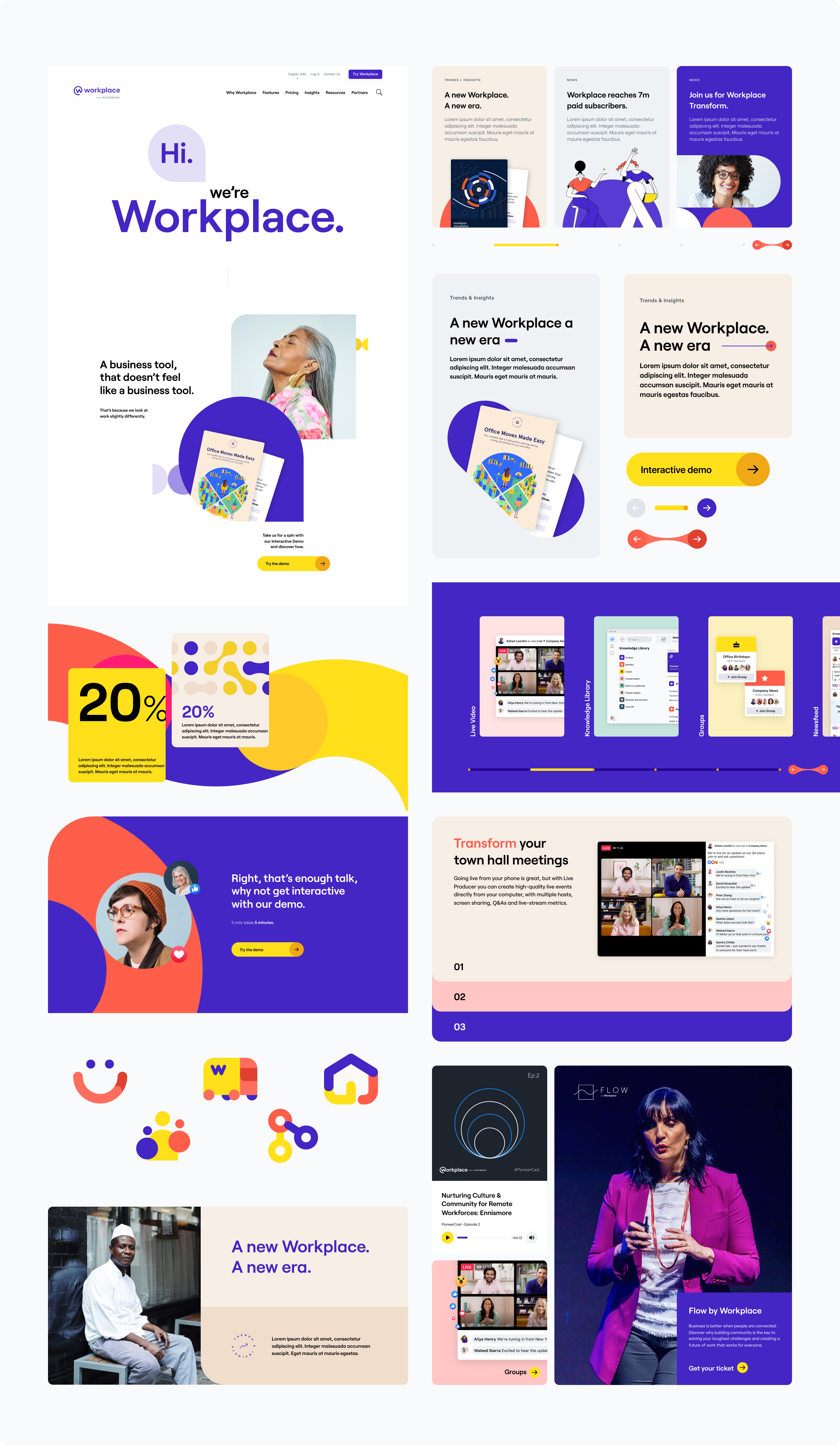
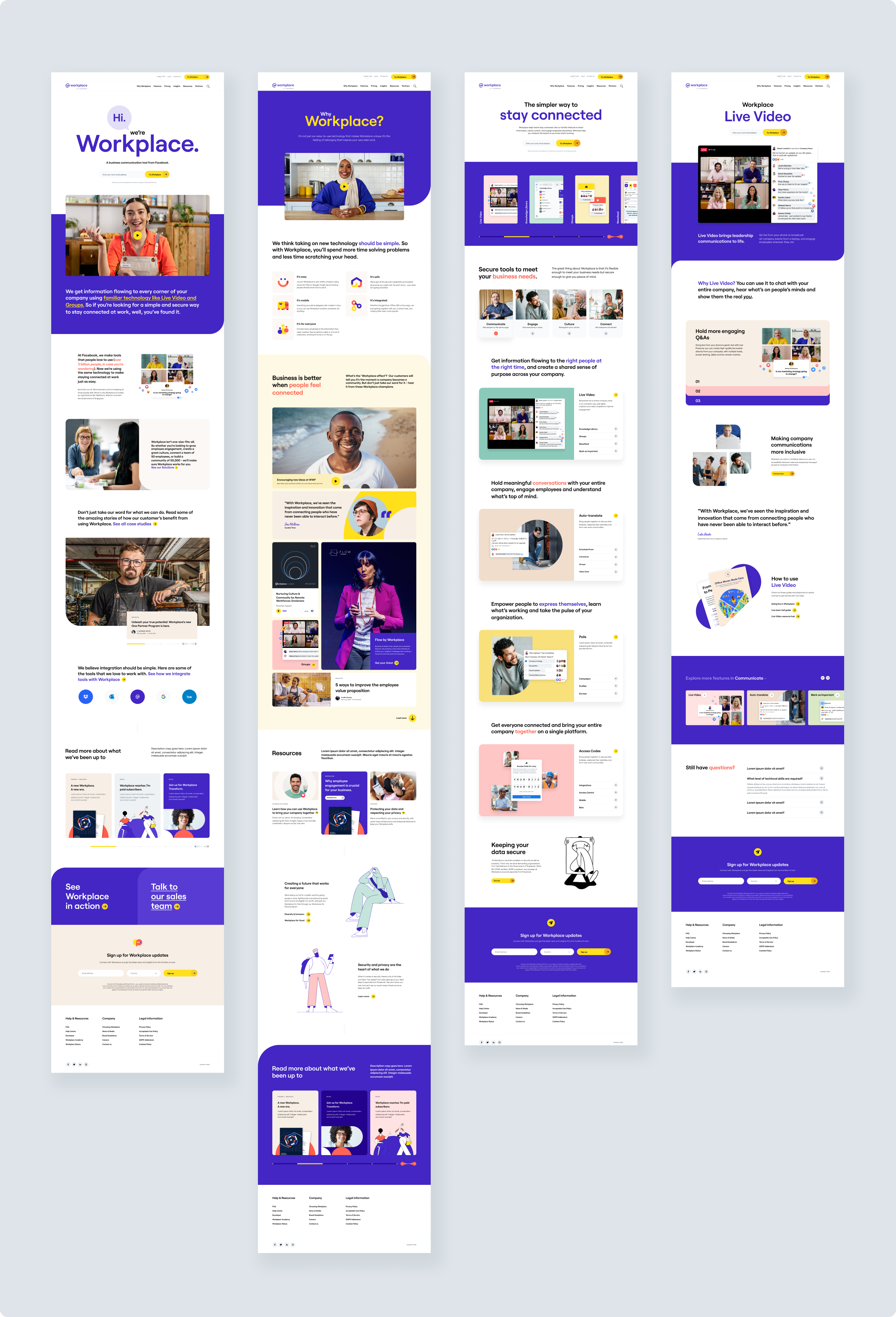
Settling on a style and rolling out the rest of the experience across all viewports.
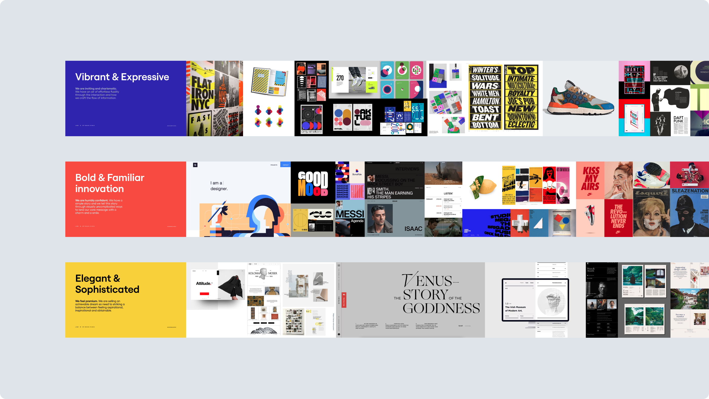
We went through a quick and extensive exploration of the experience through moodboarding and digital mark making exercises. Initial delivery of the homepage, why workplace, features overview and feature page designs were created to set the style. I helped to manage Jam3 while they roled out of some of the lower level pages. At the same time I worked on the more complicated and higher profile parts of the experience.
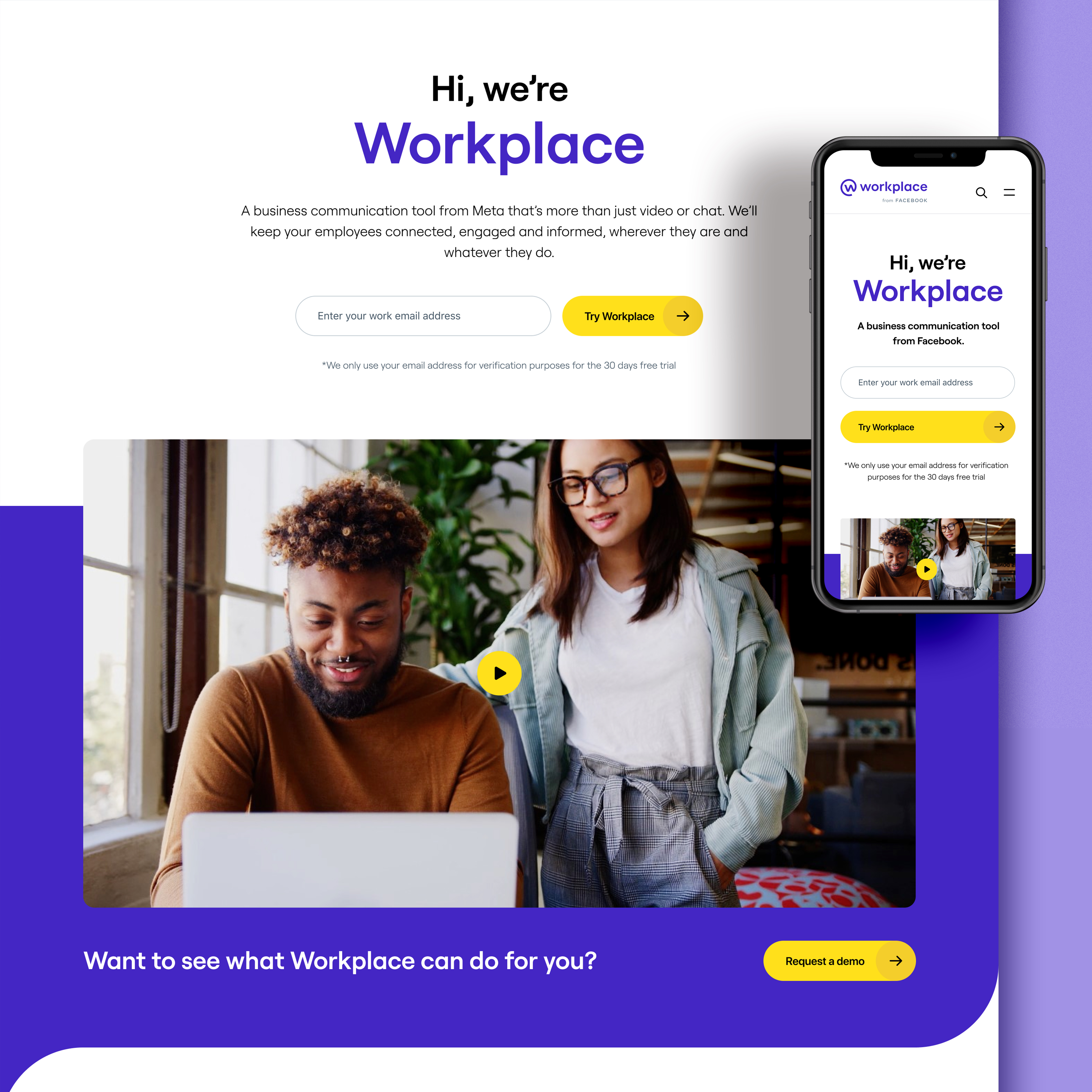
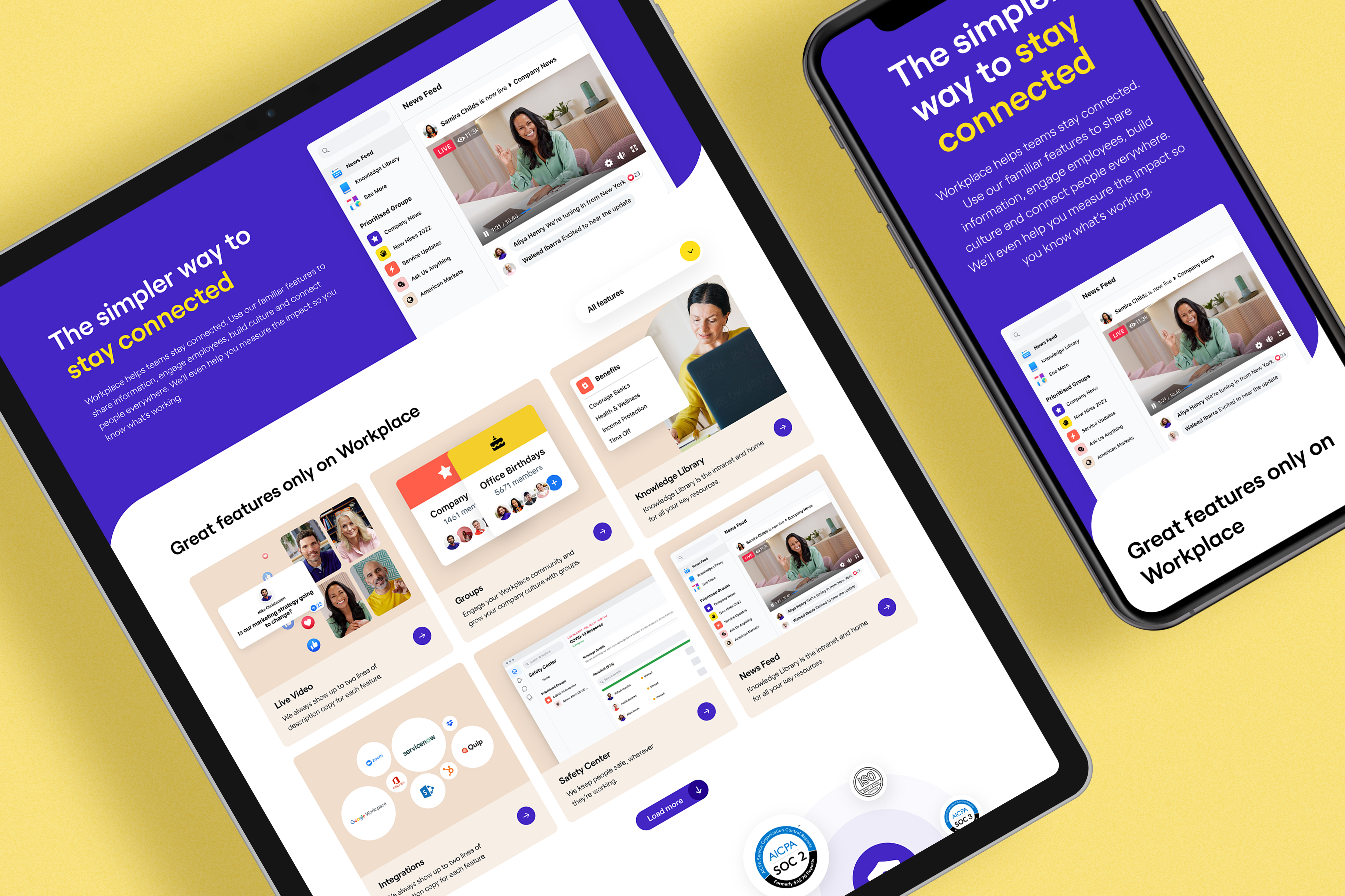
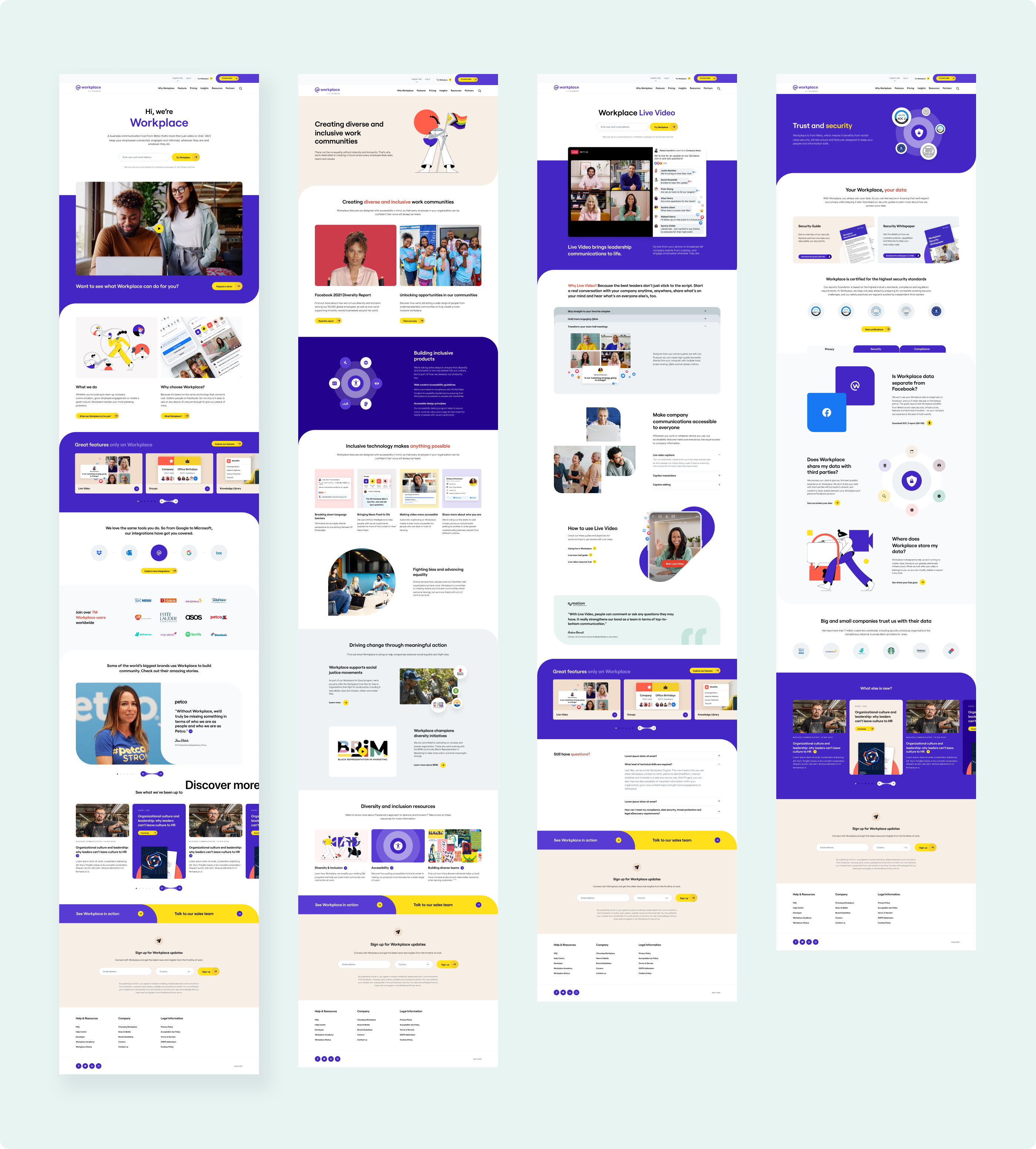
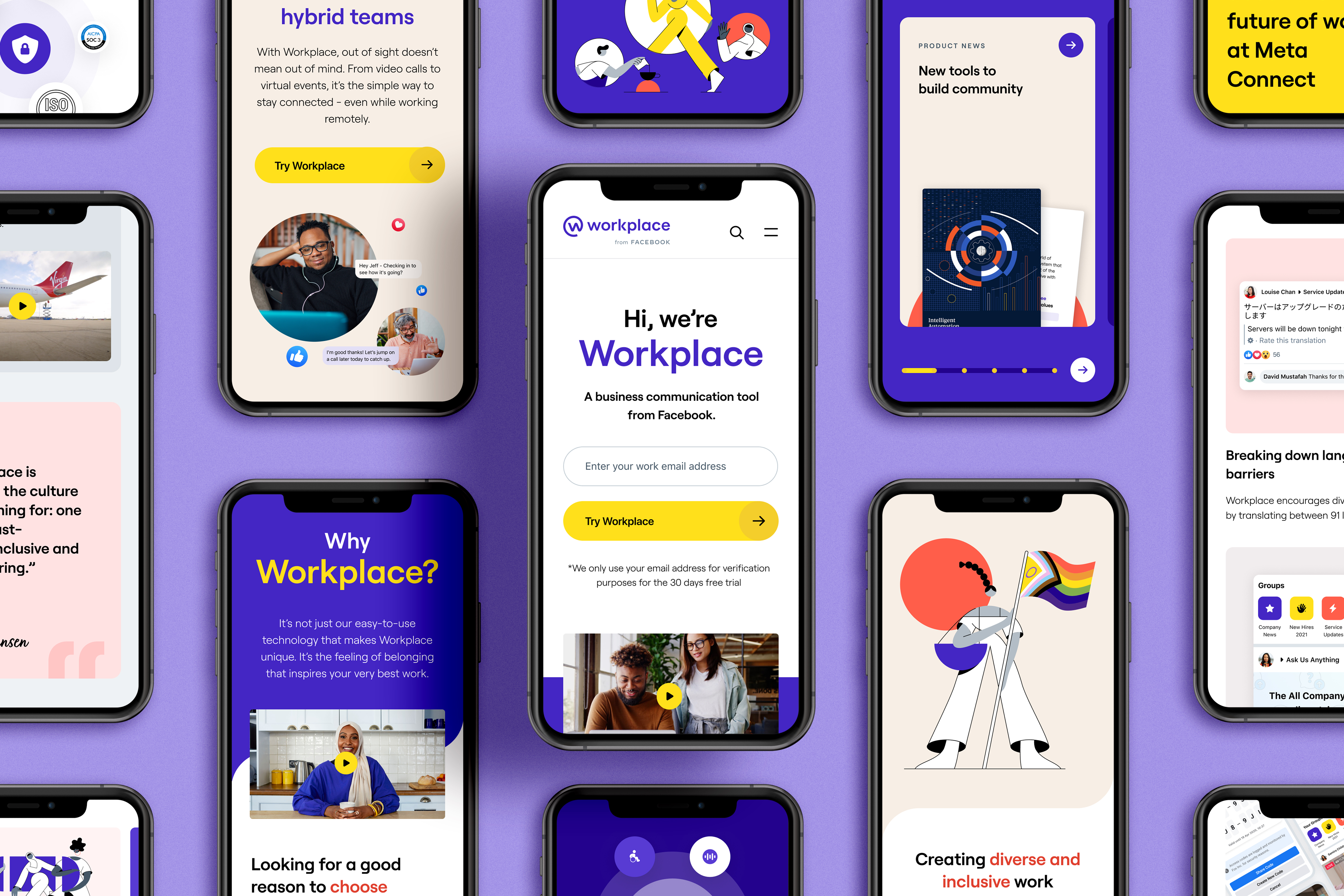
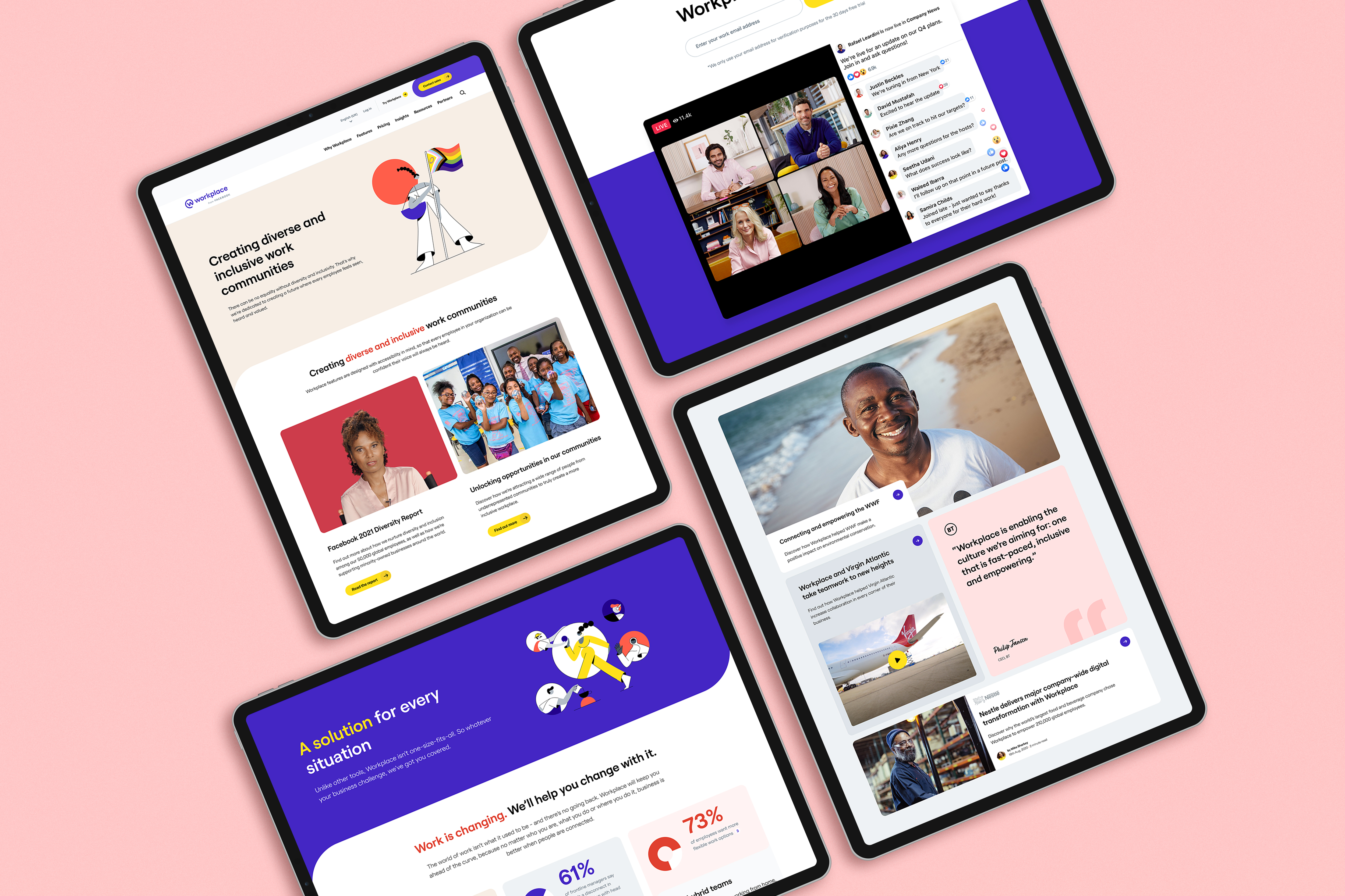
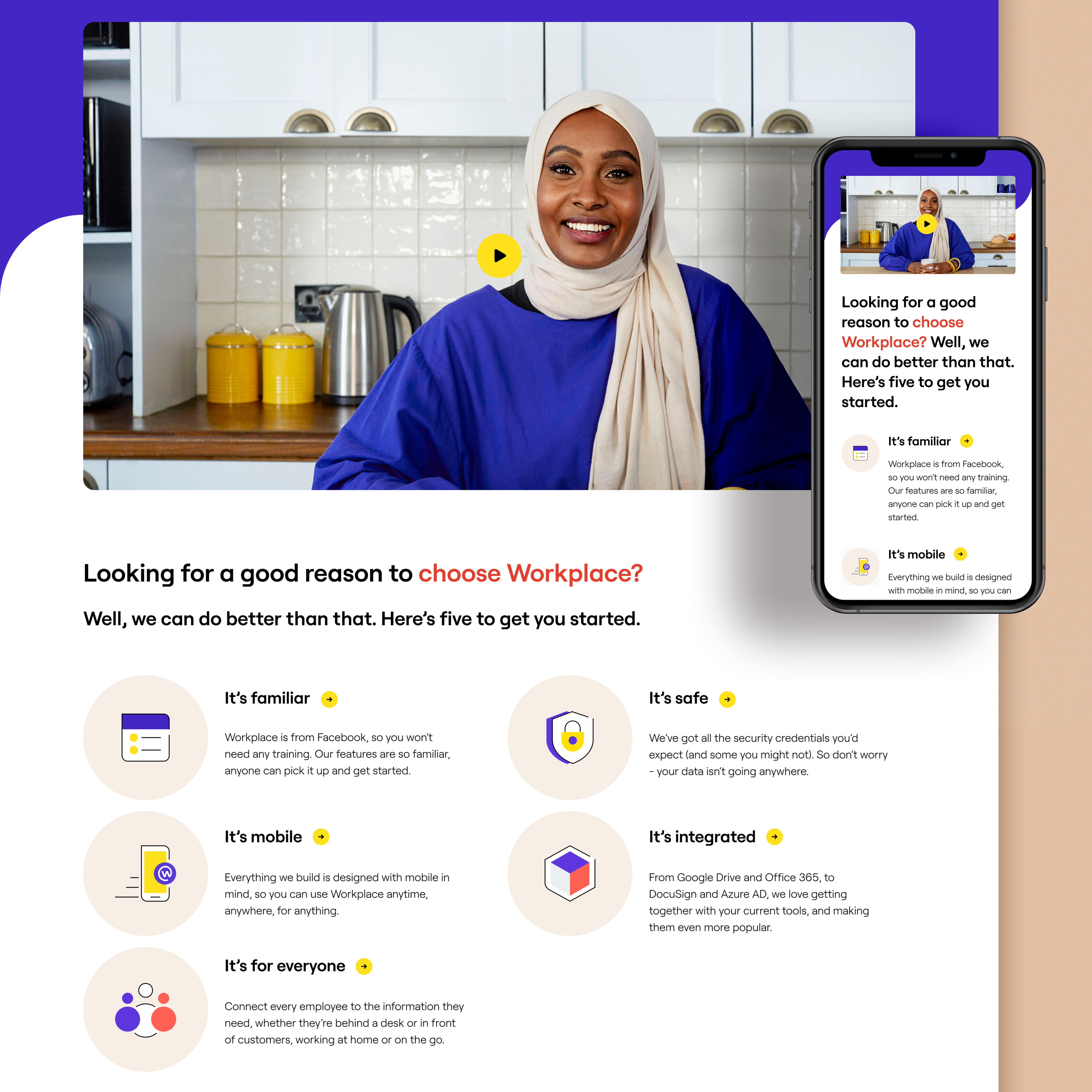
The documentation of foundational design elements and components brought consistency and speed of delivery to all of our teams.
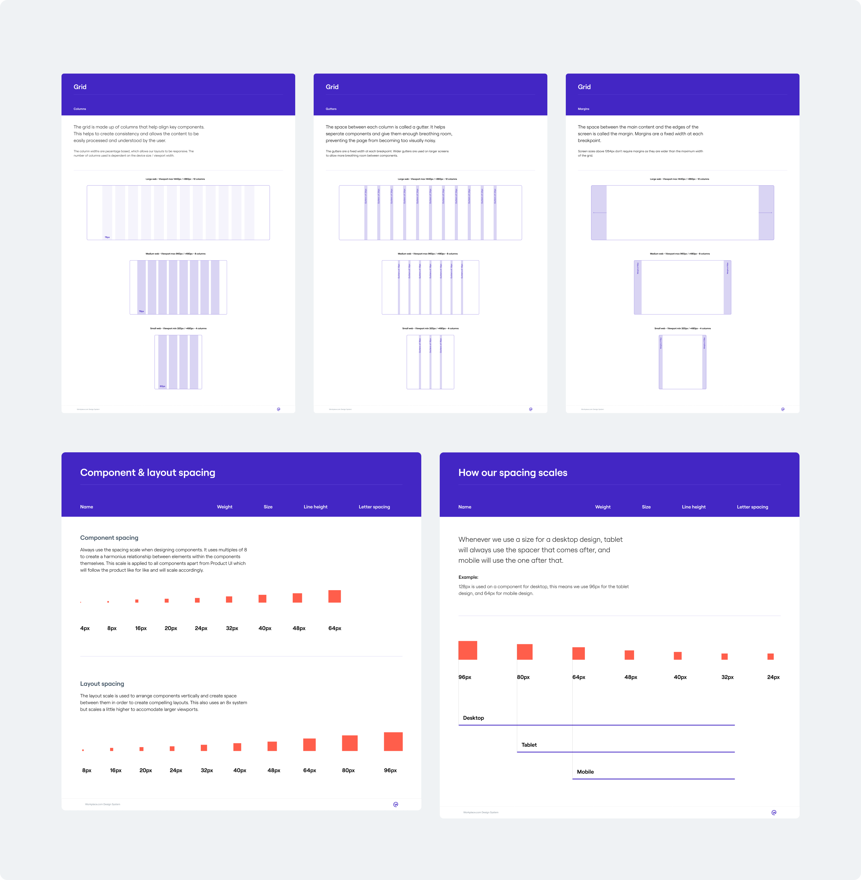
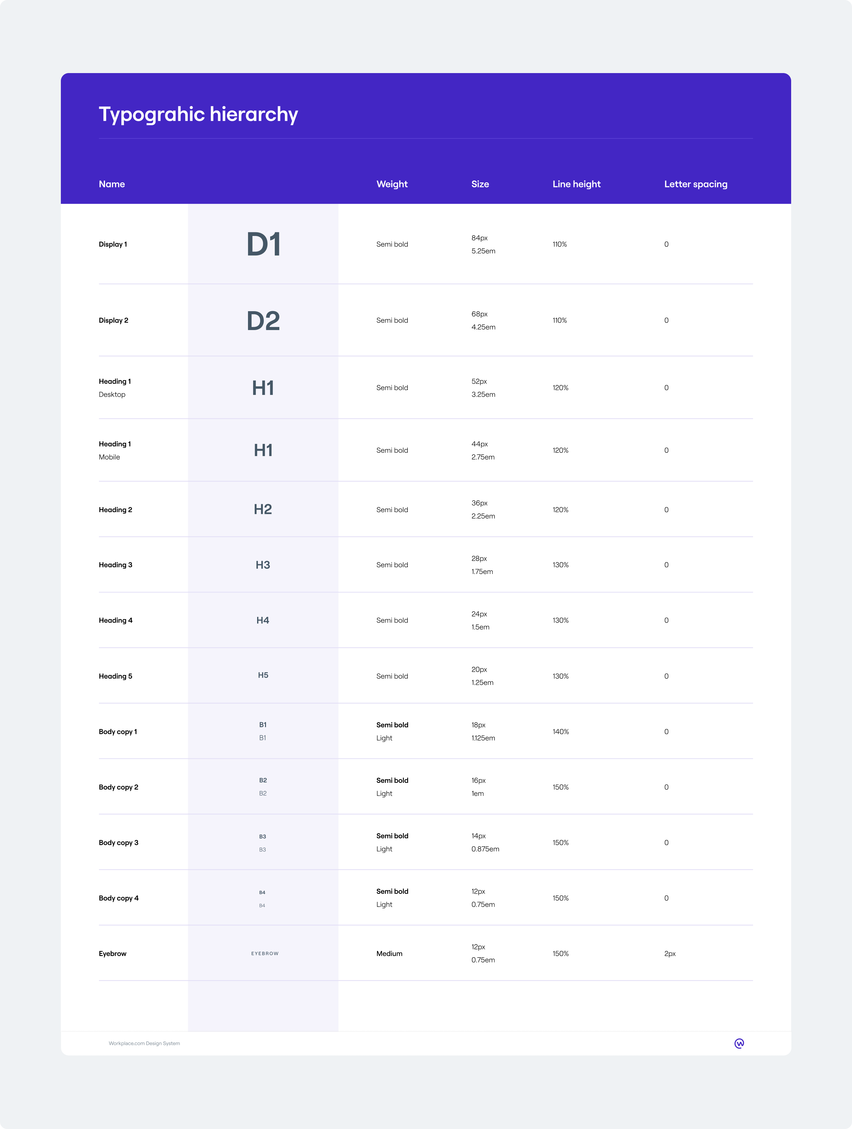
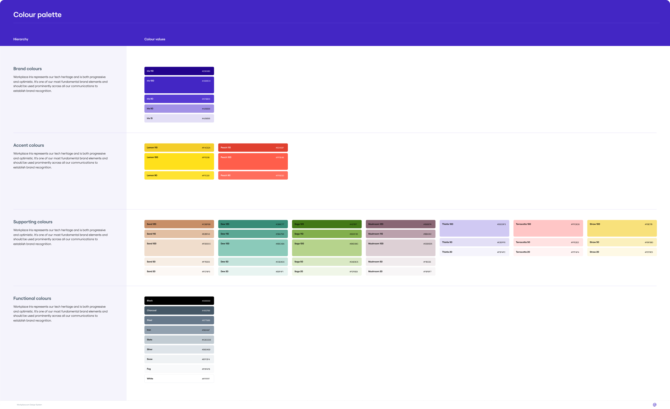
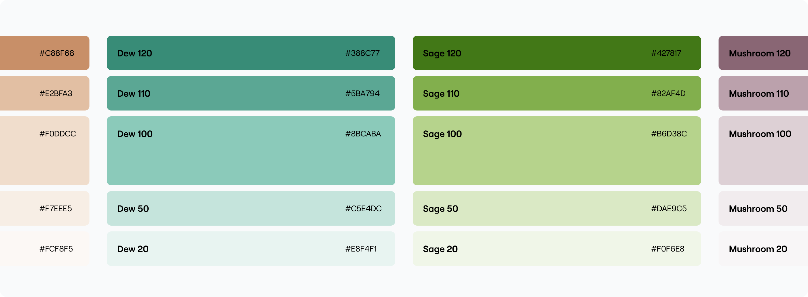
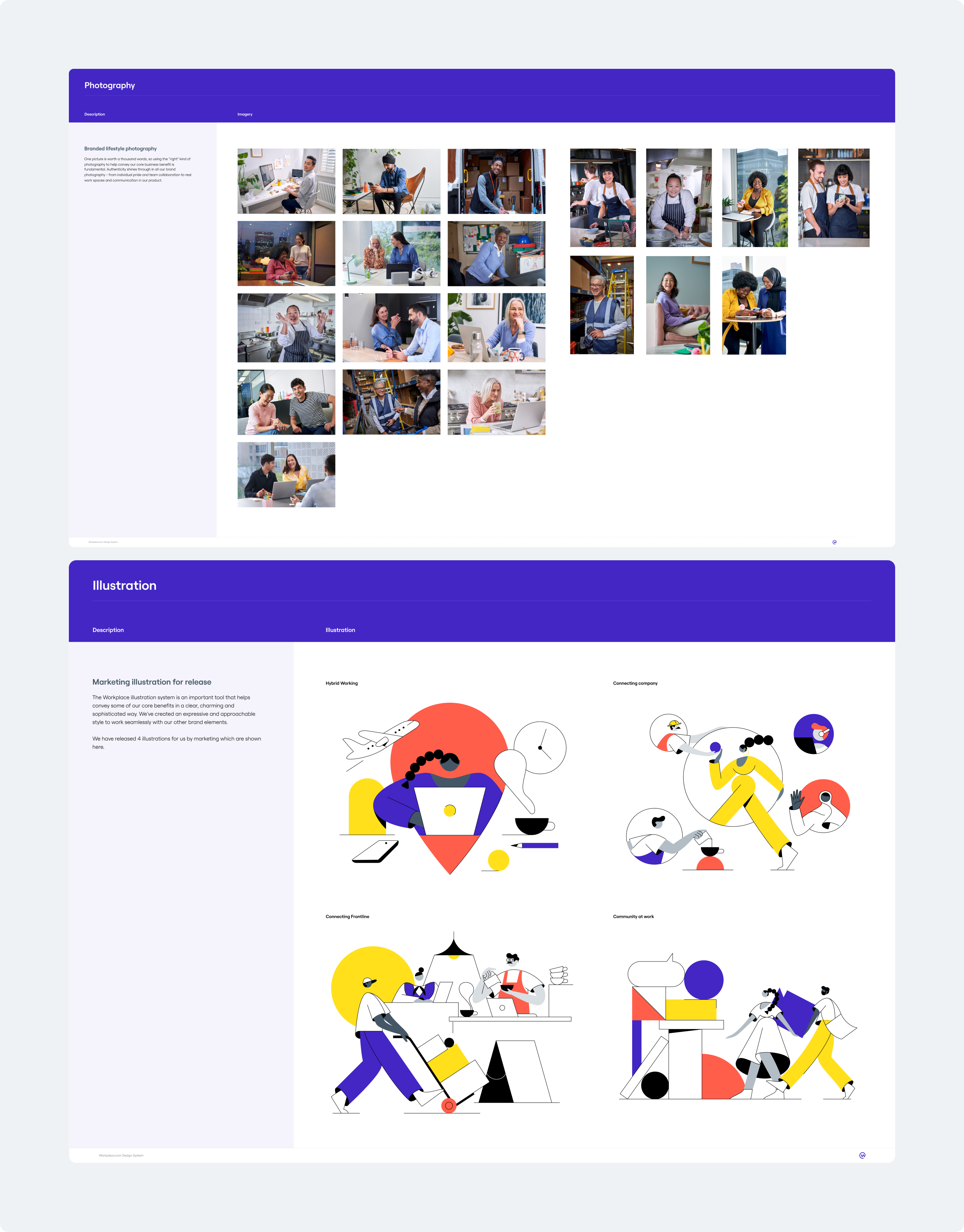
As with any design system I started with the foundational elements; the grid, typography, colour etc. We had fantastic brand elements to work with but it needed a digital first approach. For example, we developed the colour palette with accessibility in mind and adpated the typographic hierarchy to be responsive and adding in the relevant developer led attribution.
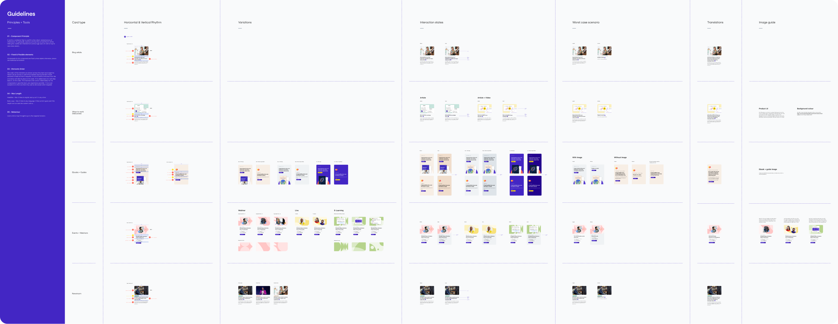
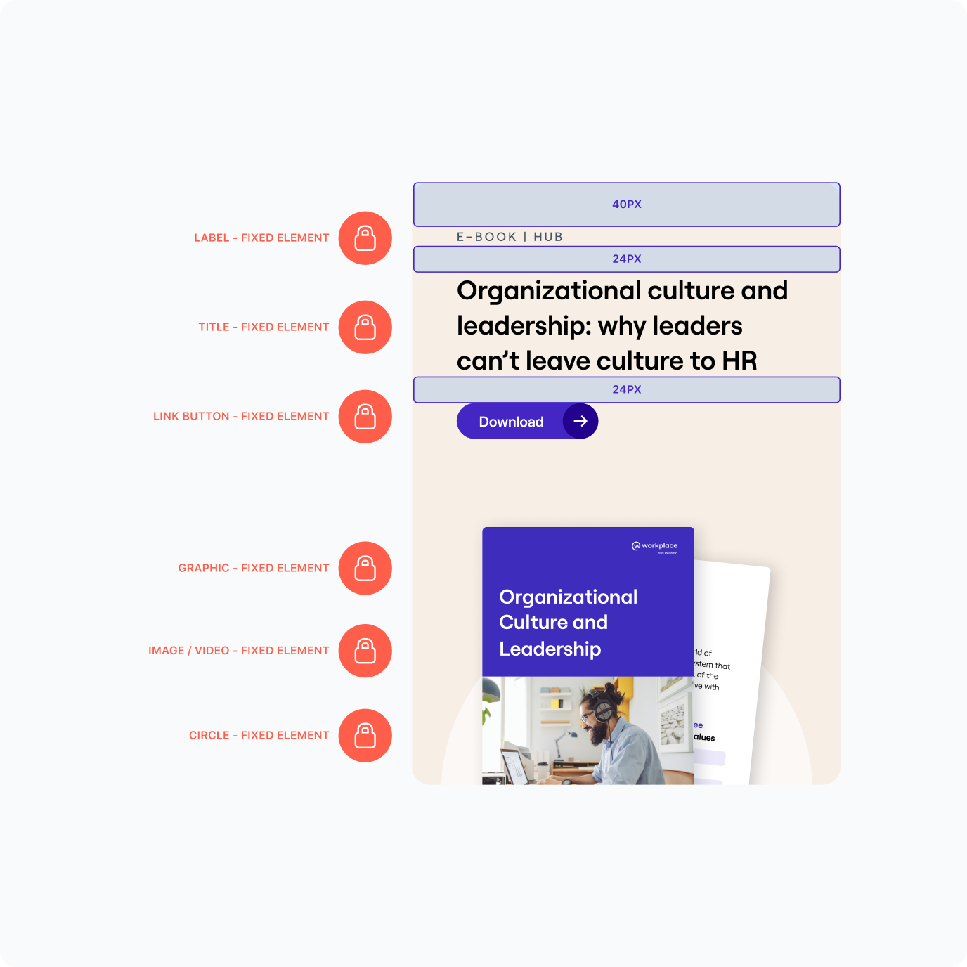
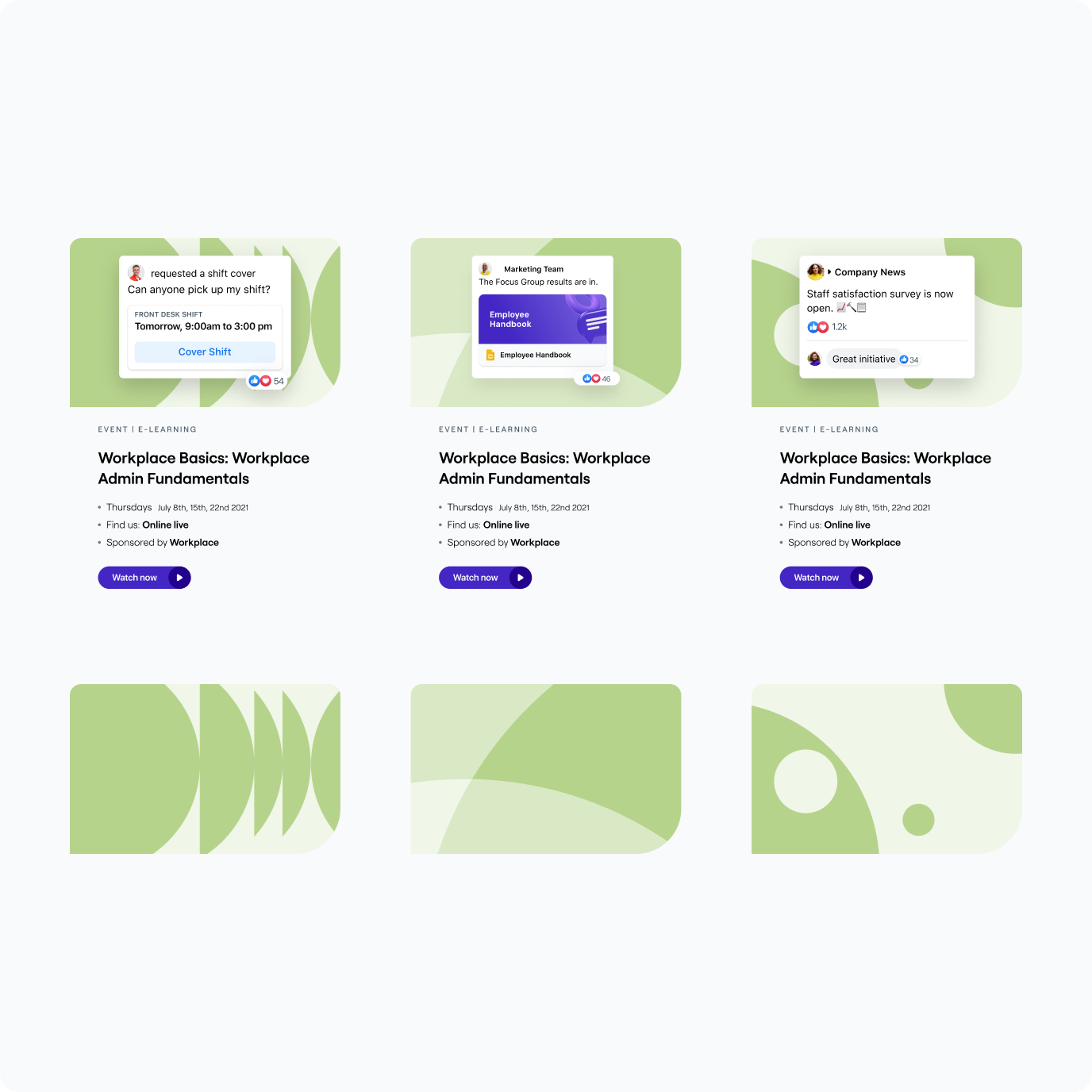
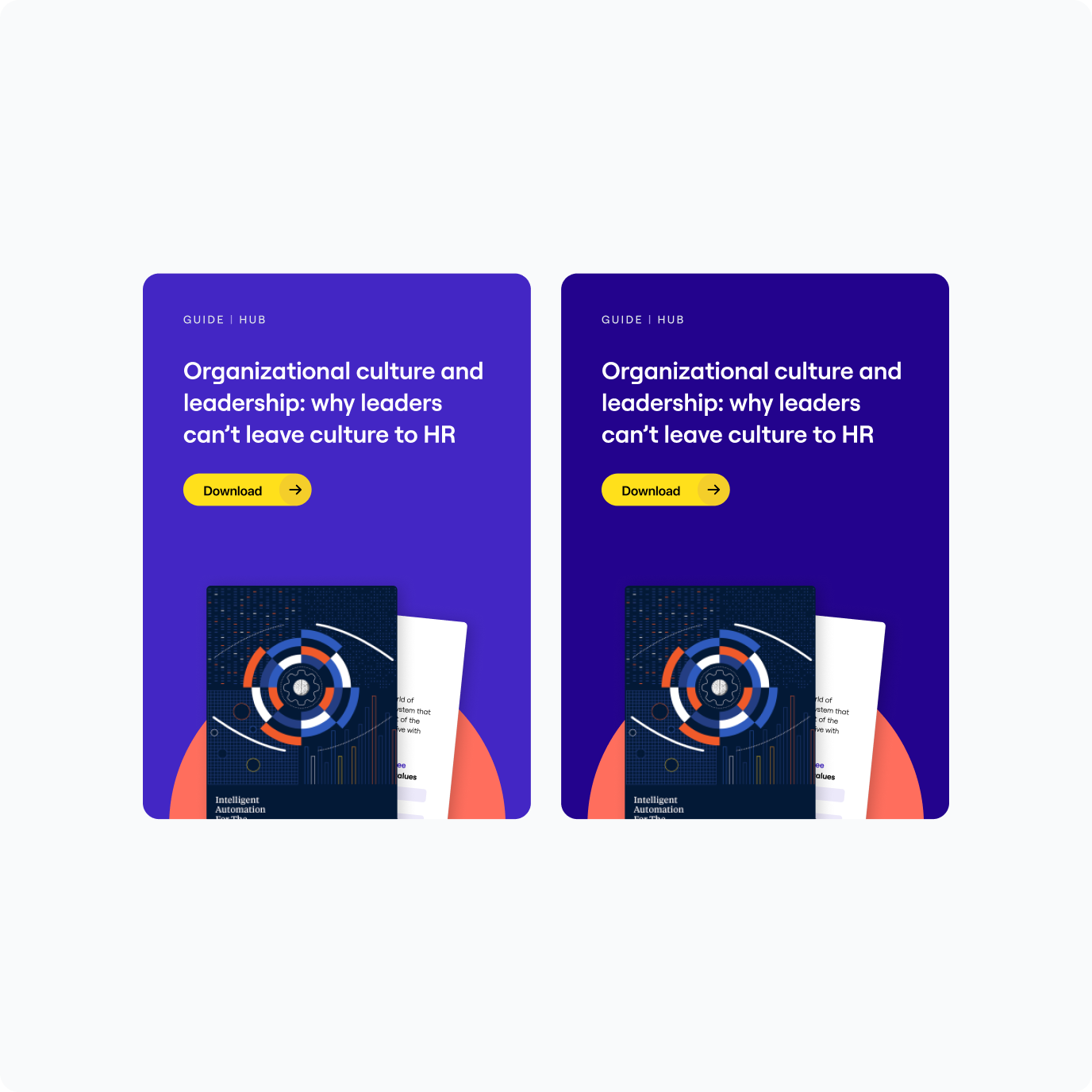
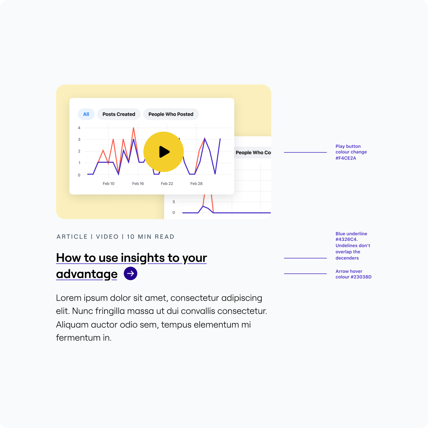
We also began to put together a component library. It's something I started to do but unfortuantely didnt get to finish. The card example is shown below.
Take a look at some of my other projects
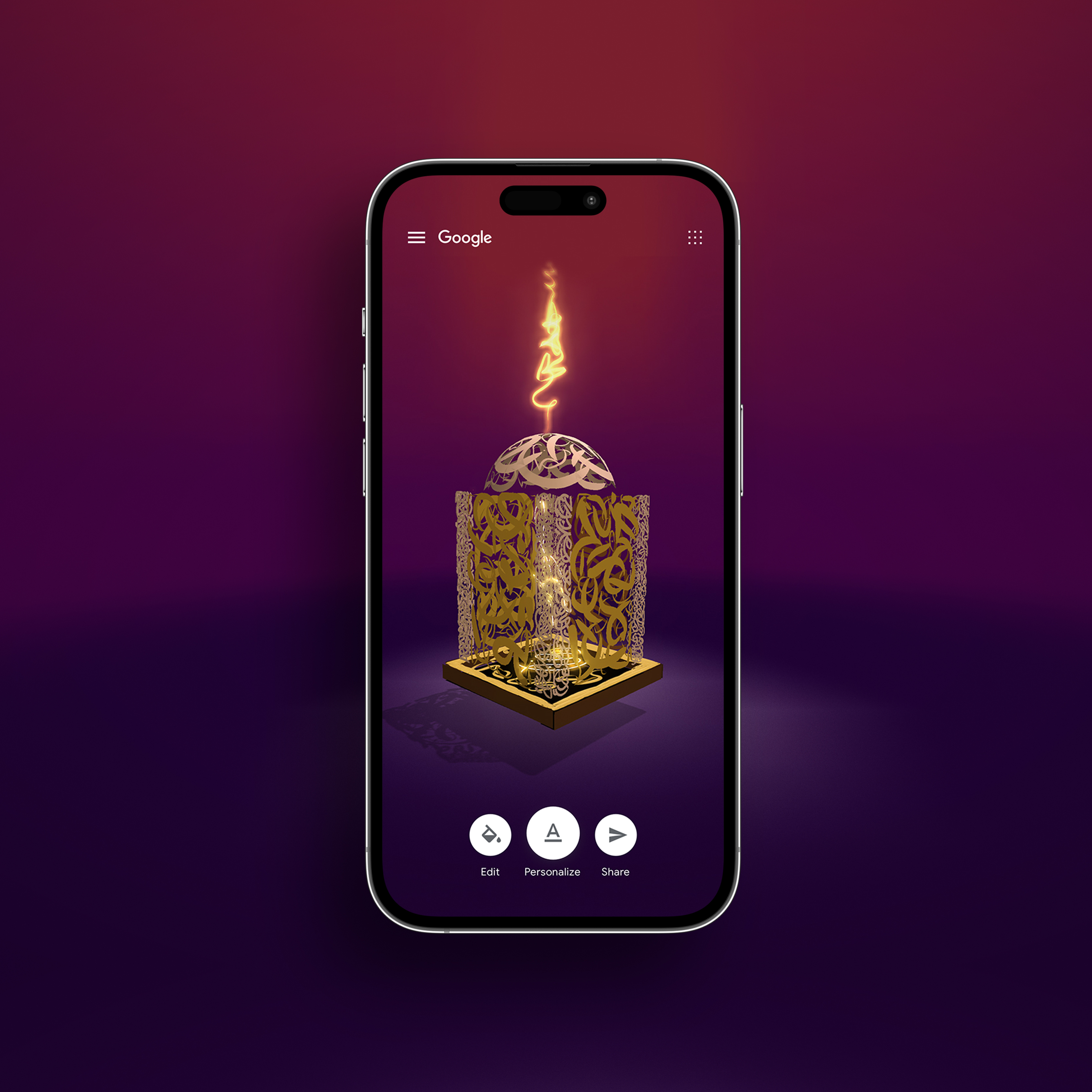
Google ✦ Qalam →Web App – UX + UI
Drivetribe →Website + App – UI design / Direction / Design system
bp ✦ Accelerate →Website – UI design + Design system
Jio ✦ Drive →Android + iOS App – UI design / Direction / Design system